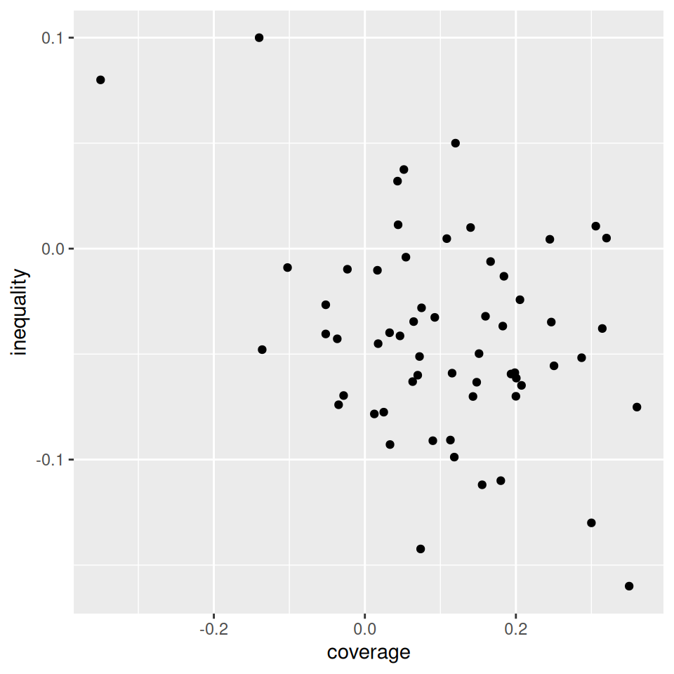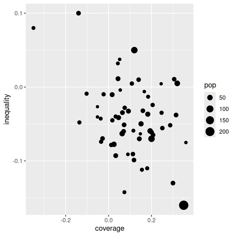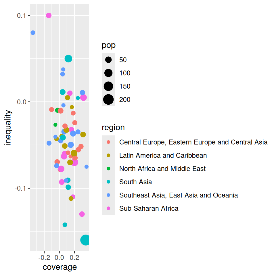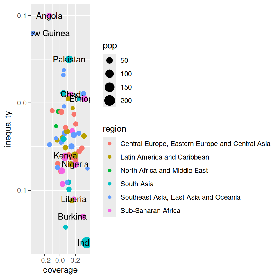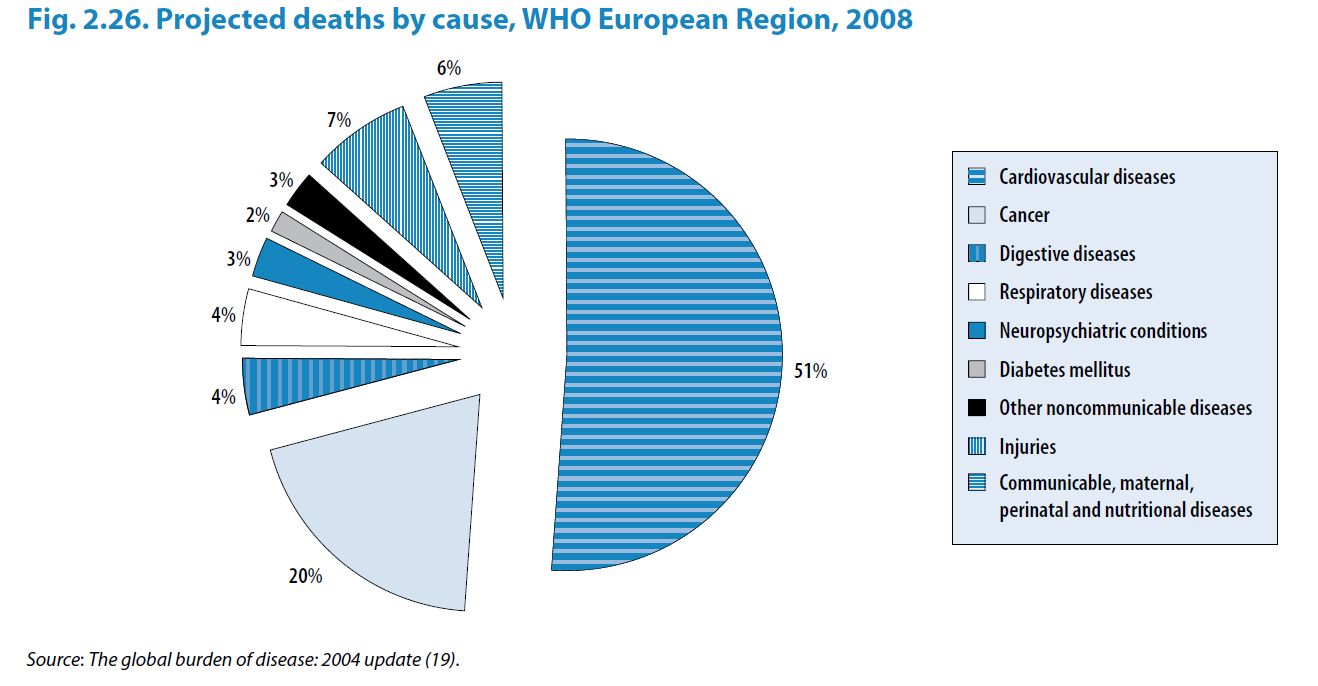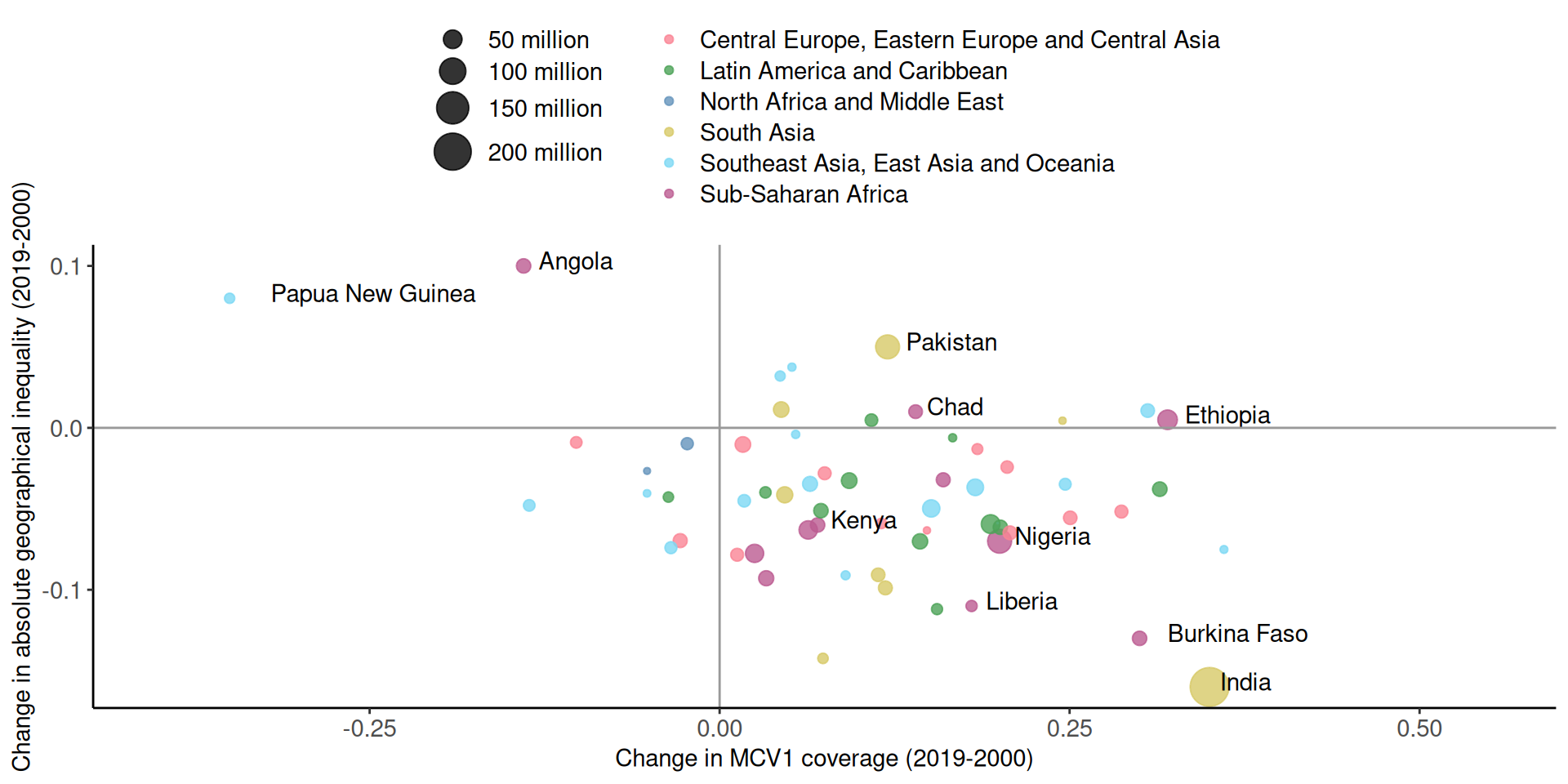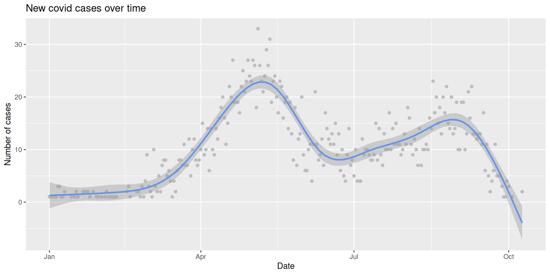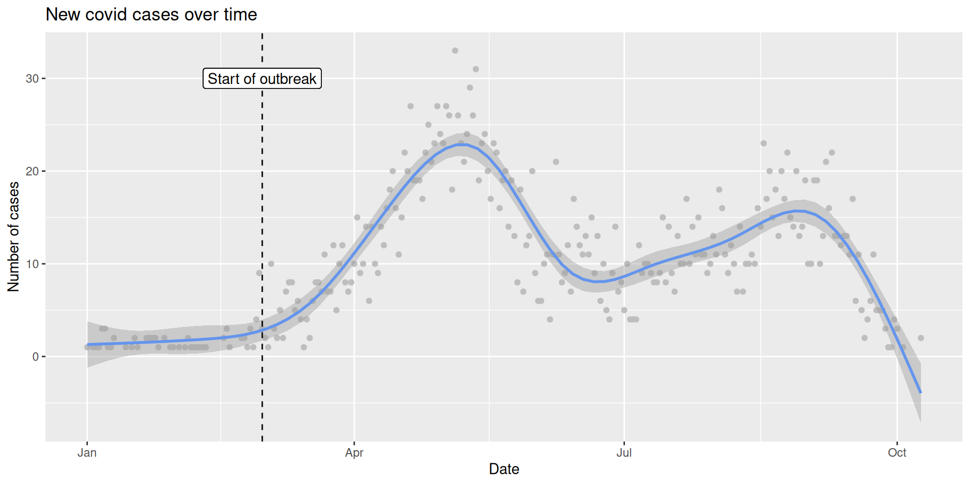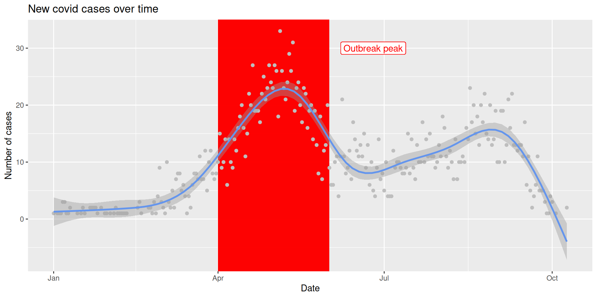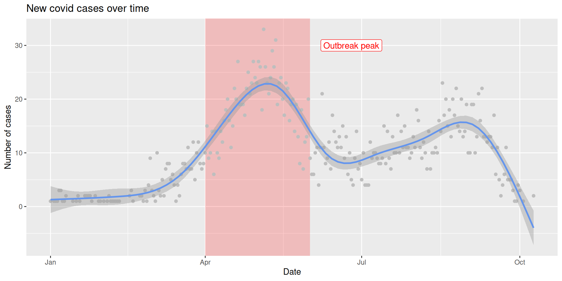
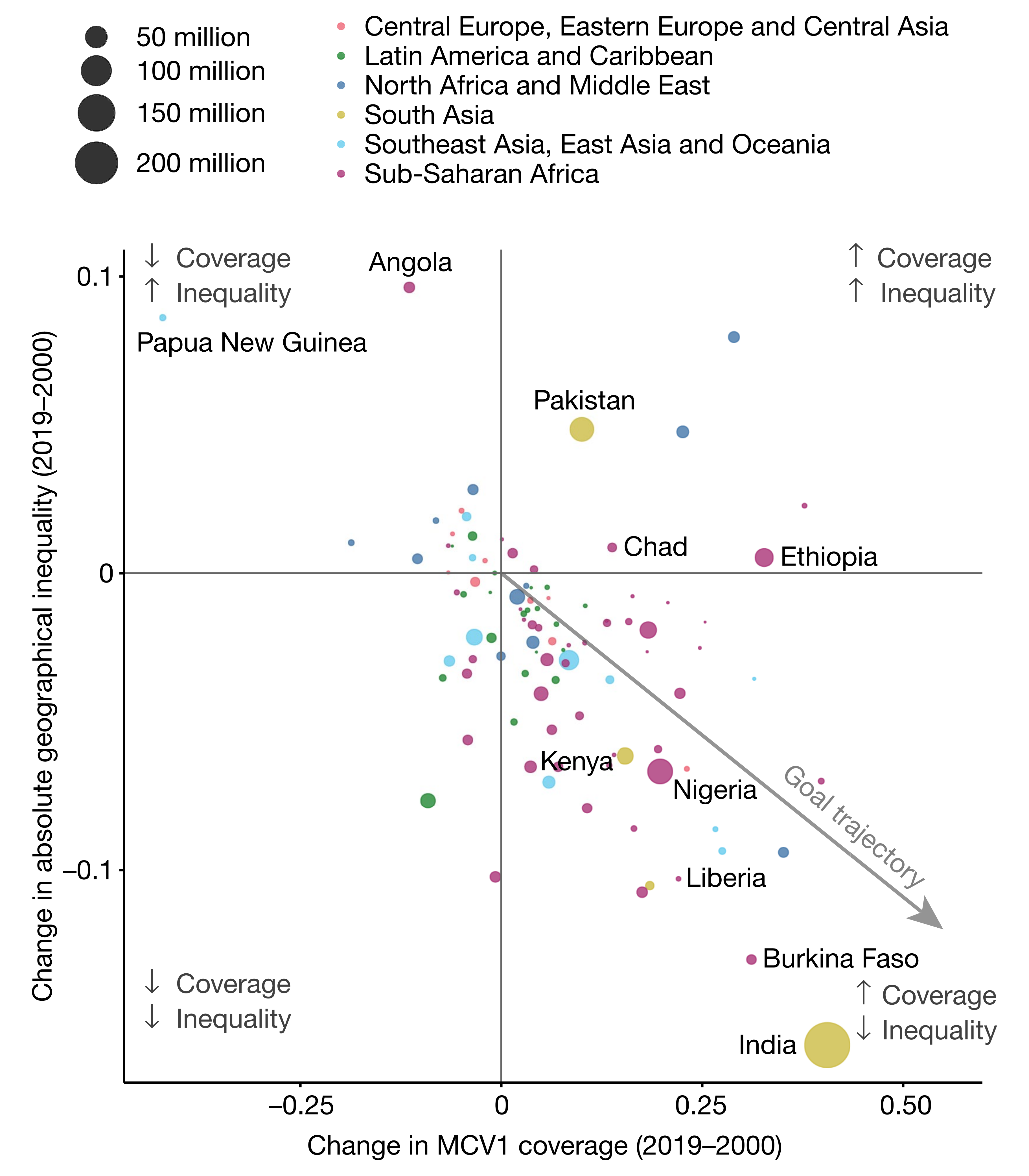
# A tibble: 6 × 5
  country          coverage inequality   pop region
  <chr>               <dbl>      <dbl> <dbl> <chr>
1 Angola              -0.14      0.1    30.2 Sub-Saharan Africa
2 Papua New Guinea    -0.35      0.08   16.5 Southeast Asia, East Asia and Ocea…
3 Pakistan             0.12      0.05   82.5 South Asia
4 Chad                 0.14      0.01   27.5 Sub-Saharan Africa
5 Ethiopia             0.32      0.005  55   Sub-Saharan Africa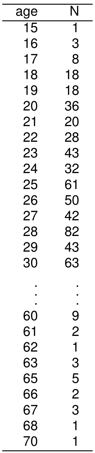
6 Kenya 0.07 -0.06 30.2 Sub-Saharan Africa Main components of a graph (R)
Mapping from information (data) to aesthetic attributes of geometric objects
Geometic objects: what you see on the plot (points, lines, bars)
Aesthetic attributes: “role” of variables in plot: location (often along x-axis and y-axis), colour, size, shape