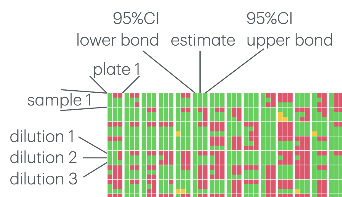
Visualize for each sample, whether titer estimates can be computed at the tested dilutions.
Details
Each sample is represented by a `n_estimates x n_dilutions` grid where cell color indicate estimate availability (green = estimate available, orange = result too low, red = result too high)
These sample grids are arranged in columns where each column represent samples from a plate
The figure below demonstrates the interpretation of the plot.